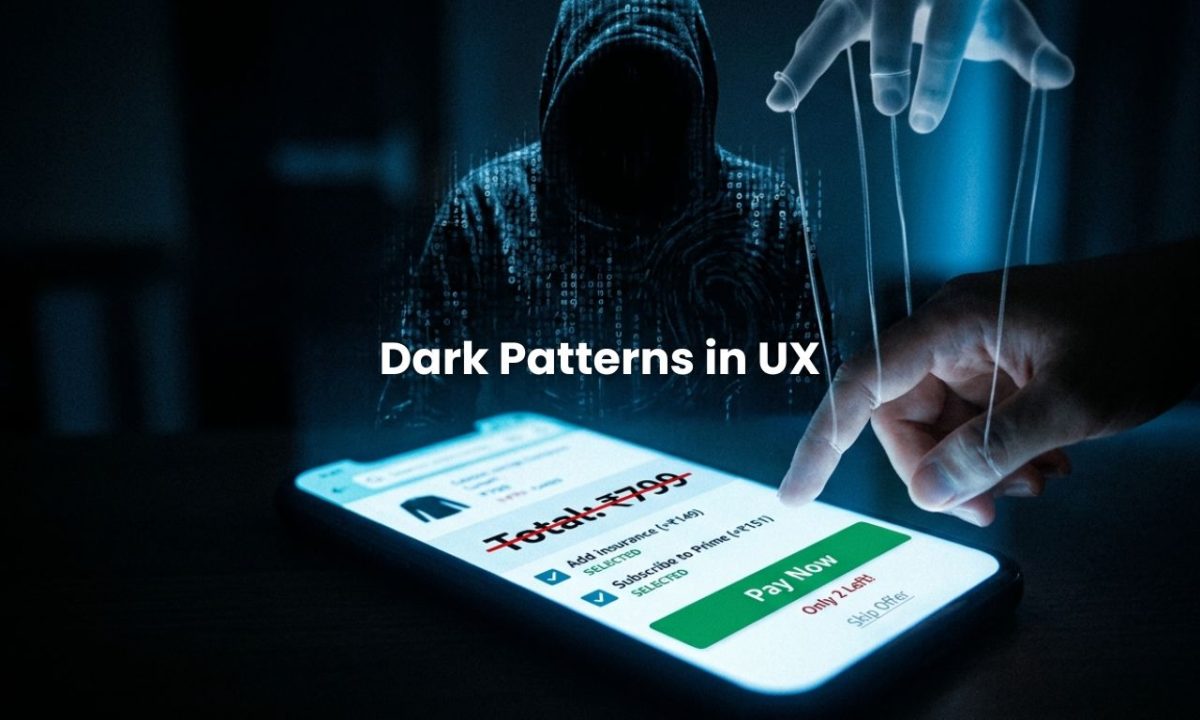

Dark Patterns Are Winning. And Honestly, It’s Not Even a Fair Fight.
I saw this stat and had to read it twice:
80% of users are getting hit by dark patterns in online payments.
Eighty.
Not 20. Not 35.
EIGHTY.
At this point, it’s not a “problem.”
It’s basically… the system.
What Are Dark Patterns?
Let me translate “dark patterns” into normal human language
It’s that moment when:
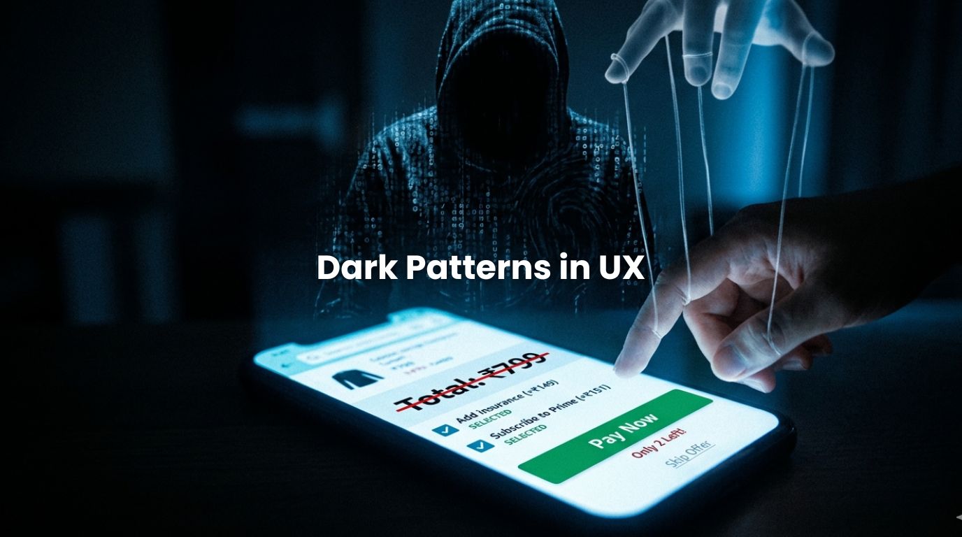
- You thought it was ₹499… and suddenly it’s ₹799
- You signed up for a “free trial”… and forgot your card was already crying
- You tried to remove an add-on… but the UI hid the “remove” button like it’s a secret level in a video game
Basically:
You didn’t make the choice. The design was made for you.
Here’s What Blew My Mind
- 63% users face hidden charges
- 68% get trapped in subscriptions
- 66% fall for bait-and-switch offers
- 61% experience sneaky add-ons
- 82% say interface manipulation is the biggest culprit
Read that again.
The Biggest Problem
The biggest problem isn’t pricing. Its design. Which means this isn’t accidental
Let’s stop pretending. This isn’t: “Oops, UI mistake.”
This is: “Let’s design this so the user accidentally pays more.”
As a Marketer, This Hits Differently
Because we’re always taught:
- Reduce friction
- Improve UX
- Make checkout seamless
And somehow…
That evolved into:
“Make paying easy, but understanding difficult.”
The Real Villain
The real villain here? Convenience. UPI, one-click payments, saved cards — all amazing.
But they’ve also created: Zero thinking time.
Earlier: You had time to rethink a purchase.
Now: You tap once and regret it later.
And dark patterns LOVE speed. Because the faster you move…The less you question.
My Favourite
My favourite (read: most irritating) dark patterns
Let’s be honest, we’ve all seen these:
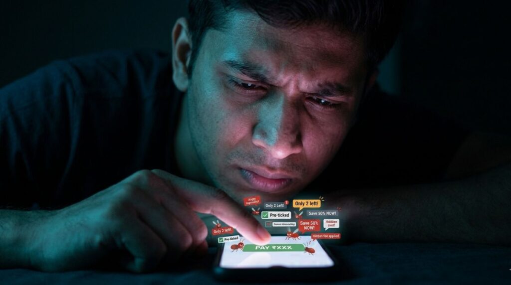
- Pre-ticked checkboxes
“Add insurance for ₹199” — already selected, obviously. - The disappearing ‘Skip’ button
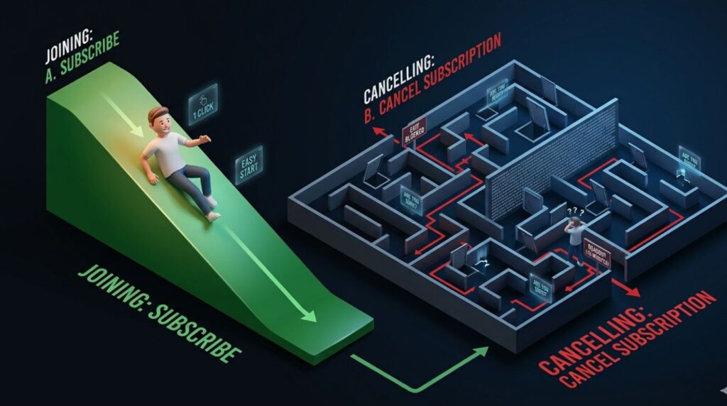
It exists… just not where your thumb is. - Free trial that needs a PhD to cancel
Joining = 1 click
Cancelling = 7 steps + emotional breakdown - Urgency pressure
“Only 2 left!!!”
Bro, it’s a digital product.
The Irony
The irony? Regulations exist.
RBI has stepped in.
Rules have tightened.
And yet…Nothing has really changed.
Why?
Because dark patterns don’t break rules. They bend psychology.
This is behavioral design at its peak. These companies understand:
- You won’t read the terms
- You’ll click fast
- You’ll trust the interface
So they design for that. And honestly… it works.
If 80% users are getting affected…Then, from a pure business standpoint:
It’s effective.
Ethical? No.
Effective? Absolutely.
The Uncomfortable Truth
Users say they hate dark patterns. But they still:
- Fall for them
- Continue using the same apps
- Rarely switch platforms
So brands are like: “Why stop?”
This is where I think things get dangerous. Because once users feel tricked enough times…They stop trusting platforms.
And when trust drops, even good UX starts looking suspicious.
My Take As A Marketer
Short term: Dark patterns boost revenue.
Long term: They destroy brand equity.
Because here’s what users remember
Not your:
- Smooth UI
- Fast checkout
- Fancy animations
They remember: “This app tricked me into paying extra.”
And that’s a hard reputation to fix.
You can’t run ads saying: “Hey, we don’t manipulate you anymore.”
What Should Users Do?
I’ve personally started doing this:
- Pause before payment (literally 5 seconds)
- Scan the final amount, not the initial price
- Avoid auto-renewal unless necessary
- Remove saved cards from random apps
Basically:
Slow down. That’s your biggest defense.
Final Thought
We always say: “Customer is king.”
But in reality? Customer is being gamed.
And honestly…
If 80% of people are getting tricked, then maybe it’s not users being careless. Maybe it’s companies being too smart for their own good.
As the industry shifts, staying informed on the tech-related news is essential for any person. Click through to read more such threads!